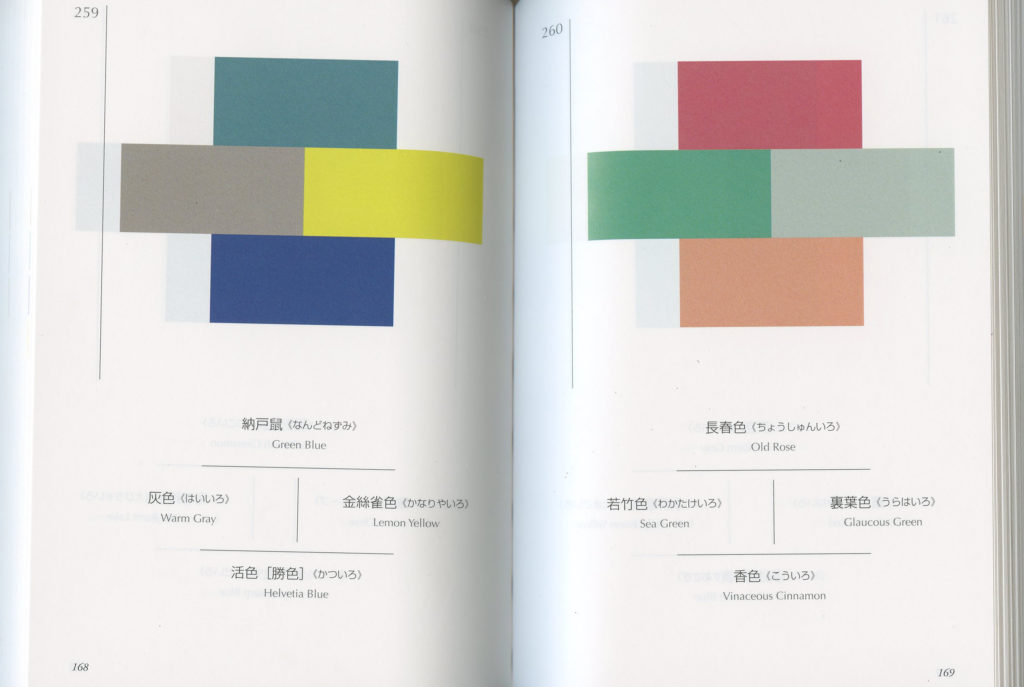
Recently I got book that has pages and pages of beautiful colour combinations. The purpose of this book was to display beautiful colour palettes that were unconventional back in early Showa period in Japan. A lot of these colours fit those gorgeous kimonos like so:
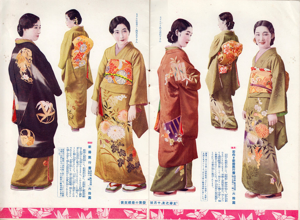
But I’ve been really busy, and instead of design beautiful, elegant kimonos like the amazing seamstress (I’m not) that I am, I decided to do a flat colour test with the colours. I thought, “Well, if it works for kimonos, shouldn’t these colours work as a standalone piece as well?”
So here’s what I thought would happen:
個展でお嫁入りした娘たち。 pic.twitter.com/Rccej5HKrr
— 撫子凛 (@nadeshicorin) May 23, 2018
And here’s what really happened:

Yeah– I know– not really the best. LOL So please set your expectations low as I show you it. I spent about 20 minutes on doing this exercise like the great dedicated artist that I am.
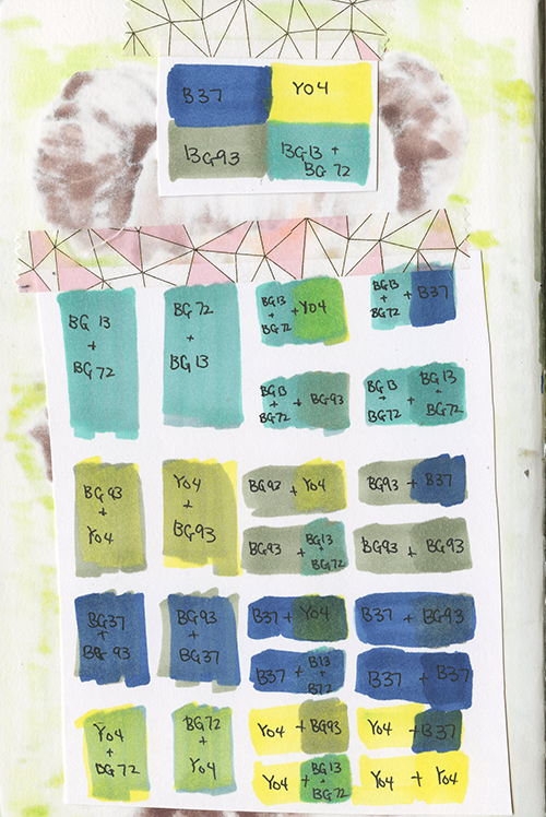
In the beginning was great: I did a colour chart (to the left) to see how the colour combination would work. I took the 4 colour combination from the left page of the scanned image at the top of this post.
(now you have to scroll up to see what the colour combination is on the page again since I am too lazy to copy and paste, sucker ![]() )
)
Although it’s hard to see it in the scanned version, the order of copic markers being layered matters. It decides the undertone of the colour and can either make the colour more saturated or muted as well as what colours will be accented more.
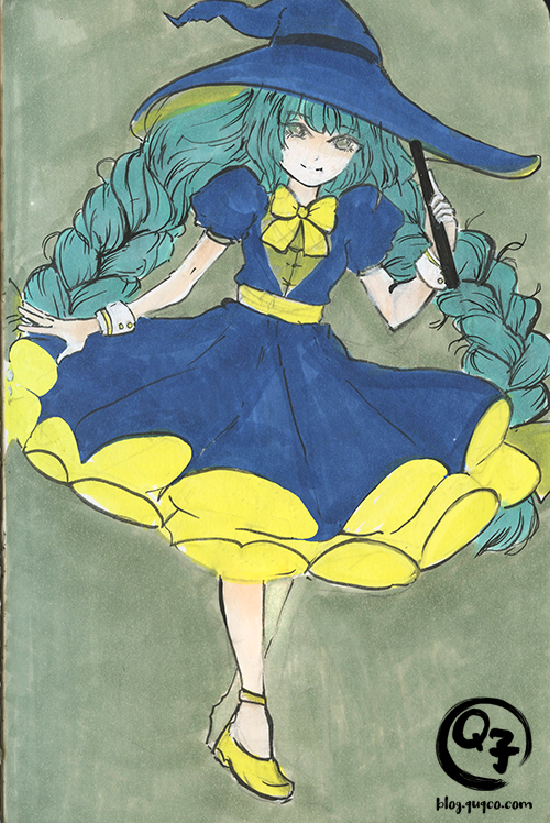
I actually like this colour dictionary! I was skeptical at first thinking these colour combinations are probably just for kimono. I didn’t bother trying to layer the colours and shade it– my initial impression was to see: Do these colours even work ok together?
Can Confirm: People of the olden days are still superior. I’m excited to try a few other pieces in the future where I full render this. 🙂
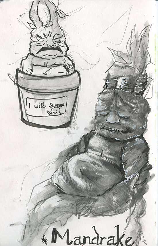
Bonus sketch! I drew this little mandrake as small doodle inbetween workflow. I hope you’ll enjoy this! <3