Let me jump straight into the meat of this post and give you the copic sketch marker colours that I currently have:
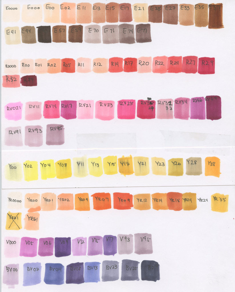
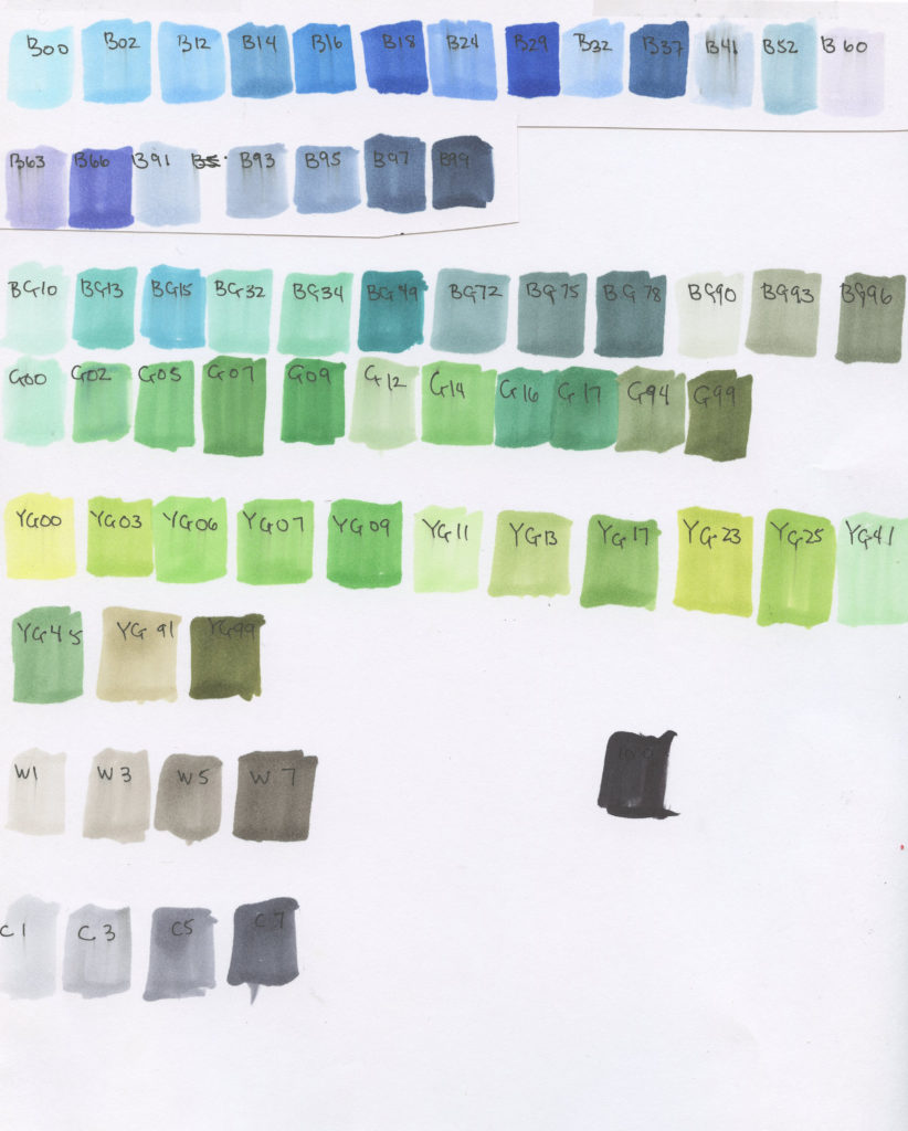 I recently bought a few more, so I think this chart will change in the future. I’ll update in the future again later! I’ve been really lazy with swatching since I had the habit of testing markers on a fresh scratch paper before applying them to a piece. Coupled that with my ability to vaguely remembering what colours looked like and how colours would mingle/mix with other frequent colour combinations, I told myself, “nah, I don’t need a swatch chart.”
Let me tell you something.
Colour Swatch Charts saves lives.

So now that I have these swatches, I have a greater understanding of what the tonal values really mean. So if you noticed, copic sketch markers have a letter plus to numbers next to it in additional to the names. Let me try and explain that for you!
The letter is in correlation to the colour it should be:
E= Earth, R = Red, RV= Red Violet, Y = Yellow, YR = Yellow Red (this is orange), V = Violet, BV = Blue Violet, V = Violet, BG = Blue Green, G = Green, Y = Yellow Green, W= Warm gray, C = Cool Gray
So now the numbers are indication of saturation and how dark the colour is.
The first number is saturated: the closer to 0, the more saturated the colour is. The more close to 9, the more muted the colour will be.
The second number is how dark: the closer to 0, the lighter the number. The more close to 9, the darker the colour will be.

There are cute names there too, but it’s more of a cute finishing touch than a true indication of the colours. Use these numbers as your almighty bible and guide to copic colours.
A small bonus:

I am kicking myself for being so simple with this one. I liked the sketch, so I didn’t want to mess it up, but AUUHGHHGdfhkjla;ehlerhjaerjlh;k

By playing it safe, I’ve successfully messed this piece up by and made it boring. A note to self: it’s ok to mess up sketches you like because they’re just sketches! If I stay a sketchbook artist all my life, I can experiment all the time. Oh yis. >u<b

In contrast, this sketch was a loose sketch where I didn’t care what happened to it. I definitely like the outcome of this one a lot more!! I shaded first with the col-erase prisma colour pencils, and it made the contrast pop even more after laying some colours on it.
Markers are fun things that create some beautiful inks when you mix them with other mediums. 🙂