
Don’t you just hate it when you sharpen a pencil 25098235612351x and each time, the lead breaks right before you get it to a good sharp point? I swear that these pencils get shorter from broken lead more than from use. (╬ಠ益ಠ) I swapped to a different sharpener halfway through thinking it was the sharpener doing it, but alas– it’s just a broken lead.
(︶︹︺)
I am happy to say that I’m finally tackling the gansai tambi watercolours and understand how to use it even more now! And that the troublesome 100% cotton fiber rough watercolour paper is revealing its secrets as well. Sometimes it’s best to not fight a medium and just let it do what it wants.
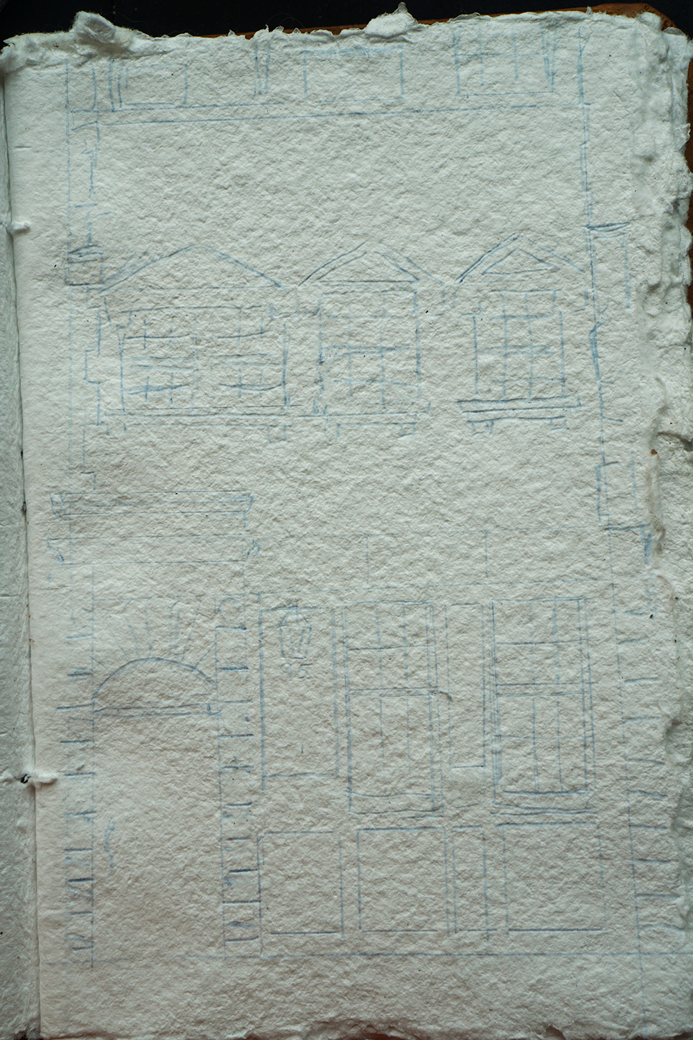
I originally sketched this building out in blue because I wanted to make it a more somber sort of piece, but the happy yellow break really got to me!

Something that did bring my mood down was when I was painting green. For some strange reason, the green was incredibly granular and the colour was super spotty. It was so frustrating to go over the green so many times. The pigment even started to pool in corners instead of spreading out correctly.
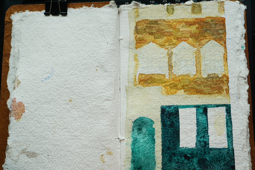
This part was my favourite little moment: Adding more layers to the yellow to create the brick-like effect. It was truly satisfying to see these little bricks pop up suddenly here and there to create a texture life.
Here you can see that I’m still fighting with the green. At this point, I even added some actual watercolour ink as reinforcement to try and darken the green! To no avail though. It looks like spotty green will be what I have to settle with.
(Spoilers: I don’t settle for this spotty green because settling is for losers. We all want to be winners ok)
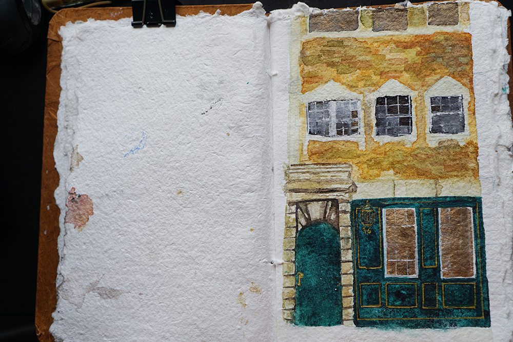
BEHOLD: A slightly darker green!!!
And here, ladies and gentlemen, is where I wish I stopped touching the piece so much. I felt so unsatisfied that the edges were not clean, that I kept wanting to add more. But now looking back, I wish I had kept it to this rough sort of look. I feel like this portrayed more of what I was looking for.
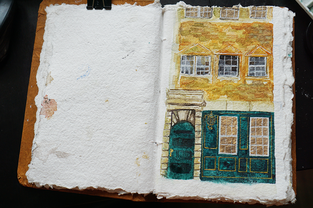
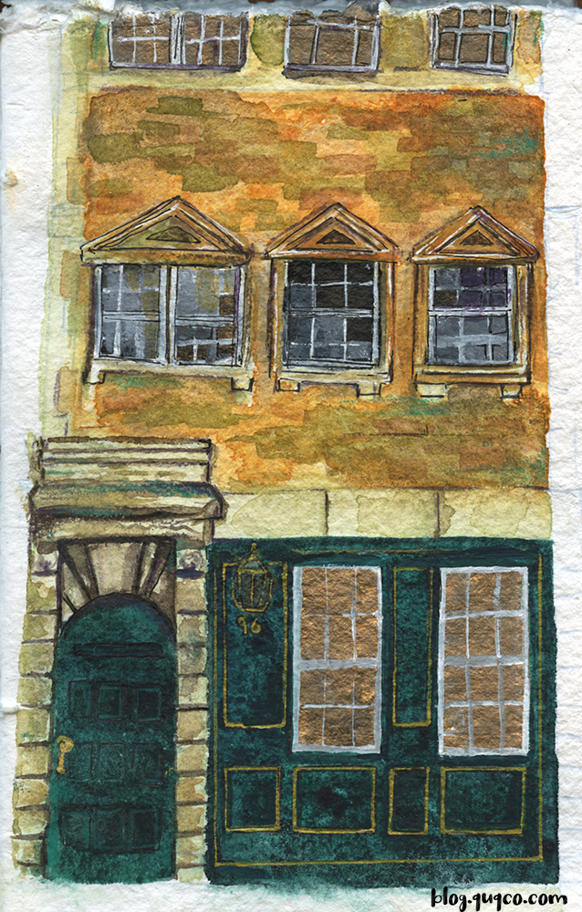
I added in some pen marks to push my darkest darks, but at this point, I felt like I had greatly ruined the piece. (。•́︿•̀。) It was incredibly frustrating to feel that sense of, “Oh I think I understand the medium and the paper better!” and look down at the page to realise that “oh, I’ve ruined the piece.”
But we learn onwards and upwards!
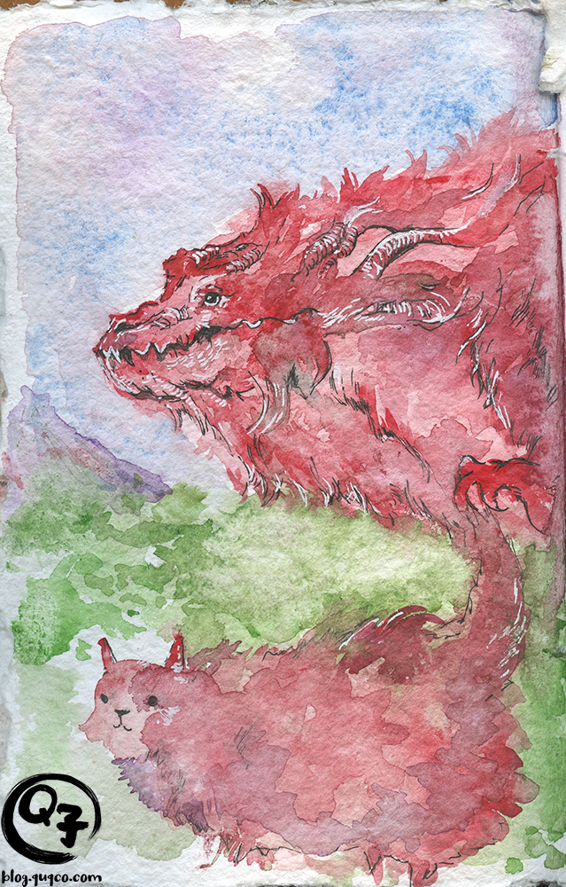
Bonus piece! I drew fan art of Dylan Griffin‘s little red monster blob he had been working on during his stream. I’ve grown quite attached to his piece, and I can’t wait to buy a print of it!